Heatmap
In Graph Builder, the Heatmap element ![]() shows the counts or average values for groups of observations using a color intensity scale. If you plot a single variable as either Y or X, your plot appears as bars. If you plot a cross tabulation of two variables Y and X, your plot shows rectangles.
shows the counts or average values for groups of observations using a color intensity scale. If you plot a single variable as either Y or X, your plot appears as bars. If you plot a cross tabulation of two variables Y and X, your plot shows rectangles.
• For a categorical variable, the levels define the groups of observations.
• For a continuous variable, Graph Builder constructs non-overlapping intervals of values. These intervals define the groups of observations.
Note: If all of the rows used in constructing a bar or rectangle on the plot are hidden and not excluded, the rectangle is not shown, but the position that it would occupy remains.
When you create a heatmap, an intensity legend appears in the Legend area. See Discrete or Continuous Legend Items. The intensity legend shows counts or average values:
• If no Color variable is assigned, the counts in each bar or rectangle define the scale for the intensity legend.
• If a Color variable is assigned, the average of that variable for the observations in each bar or rectangle define the scale for the intensity legend.
Tip: Hover over a cell to see labels. Click a cell to select the corresponding rows.
To color or size a heatmap by two variables, drag the first variable into the Color or Size zone and then drag the second variable into the top or bottom corner of the zone.
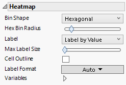
Figure 3.35 Heatmap Options
Bin Shape
(Available for continuous variables). Specifies the shape of the bin.
Hex Bin Radius
(Available for hexagonal bins.) Enables you to adjust the radius of the bin.
Label
Specifies labels for the heatmap. You can label by value, percent of total, or by row.
Max Label Size
Enables you to adjust the size of the label.
Cell Outline
(Available when a size variable is used.) Enables you to add outlines for the original bin sizes. This highlights the size scaling on the bins.
Label Format
(Available for value and percent labels.) Enables you to set the format for the cell labels.
Variables
Shows or hides graph elements for variables, or re-orders the display of variables.
Note: These options do not apply to variables in the Group X, Group Y, Wrap, or Page zones.
Check boxes are followed by the zone designation and the name of the variable. Use check boxes to do the following:
– Show or hide the elements corresponding to a variable in a zone.
– Add or remove the effect of applying the Color, Size, Shape, or Freq variable to the variable in the zone.
Tip: If you have multiple graphs, you can color or size each graph by different variables. Drag a second variable to the Color or Size zone, and drop it in a corner. In the Variables option, select the specific color or size variable to apply to each graph.
Use arrows to re-order the display if there are multiple variables in a zone. Highlight a variable name and click an arrow to reposition it.
For an example using Variables, see Example of an Area and Line Chart.
Use a Heatmap to Apply Background Colors
You can also use the heatmap to control the background color when you have plot elements that use the Wrap, Group X, or Group Y zones. To do so:
1. Select the variable for the background color and drag it to the Color zone.
2. Select the Heatmap element ![]() .
.
3. Construct the plot elements.
In the Heatmap panel, under Variables, deselect all check boxes except the one for Color.
