Figure 2.60 Example of an Overlay Plot
Note: To plot data over time, you can also use Graph Builder, bubble plots, control charts, and variability charts. For complete details about Graph Builder and bubble plots, see Graph Builder in the Essential Graphing book. Refer to Control Chart Builder and Variability Gauge Charts in the Quality and Process Methods book for information about control charts and variability charts.
This example uses the Stock Prices.jmp data table, which contains data on the price of a stock over a three-month period.
|
1.
|
|
2.
|
Select Graph > Legacy > Overlay Plot.
|
|
3.
|
|
4.
|
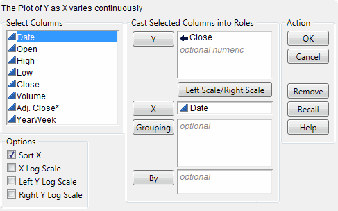
Figure 2.61 Overlay Plot Window
|
5.
|
Click OK.
|
Figure 2.62 Overlay Plot of the Closing Price over Time
|
1.
|
From the red triangle menu, select Connect Thru Missing.
|
|
3.
|
Select the Major Grid Lines check box.
|
|
4.
|
Click OK.
|
Figure 2.63 Connected Points and Grid Lines
|
1.
|
Follow the steps in Create the Overlay Plot of the Stock’s Price over Time, this time assigning both High and Low to the Y role.
|
Figure 2.64 Two Y Variables
The legend at the bottom of the plot shows the colors and markers used for the High and Low variables in the graph. The overlay plot shows that the High price and Low price track each other very closely.


