Pie
In Graph Builder, the Pie element ![]() plots summary statistics for groups of observations, representing their values as the size of the slices or rings on a pie chart.
plots summary statistics for groups of observations, representing their values as the size of the slices or rings on a pie chart.
Note: If any of the rows used in constructing a slice of the pie chart are hidden and not excluded, the slice is not shown, but the position that it would occupy remains.
• For a single variable, the slice sizes the number of observations in each category.
• For two variables, the variable in the Y zone is used to size the slices according to the selected Summary Statistic. A legend appears in the Legend zone showing the values of the variable in the X zone.
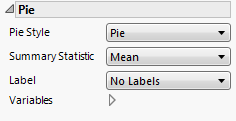
Figure 3.36 Pie Options
When you add an Overlay variable, a ring chart is constructed for each level of the Overlay variable. The outer ring represents the smallest value in the value ordering, and the inner ring represents the largest value.
Pie Style
Changes the appearance of the pie chart. For pie style descriptions, see Table 3.4.
Summary Statistic
Changes the statistic that is plotted.
Label
Adds or removes labels in the pie chart.
Label Format
(Available for value and percent labels.) Enables you to set the format for the cell labels.
Variables
Shows or hides graph elements for variables, or re-orders the display of variables.
Note: These options do not apply to variables in the Group X, Group Y, Wrap, or Page zones.
Check boxes are followed by the zone designation and the name of the variable. Use check boxes to do the following:
– Show or hide the elements corresponding to a variable in a zone.
– Add or remove the effect of applying the Color, Size, Shape, or Freq variable to the variable in the zone.
Tip: If you have multiple graphs, you can color or size each graph by different variables. Drag a second variable to the Color or Size zone, and drop it in a corner. In the Variables option, select the specific color or size variable to apply to each graph.
Use arrows to re-order the display if there are multiple variables in a zone. Highlight a variable name and click an arrow to reposition it.
For an example using Variables, see Example of an Area and Line Chart.
Pie Style | Description |
|---|---|
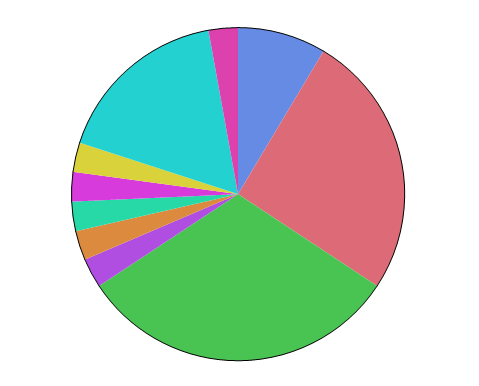
Pie | Traditional pie chart with each slice sized by the Summary Statistic.
|
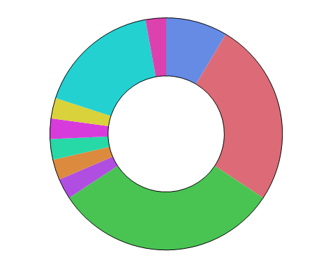
Ring | Each variable or level of a stratifying variable is represented by a concentric ring. The sections are sized by the Summary Statistic. Ring charts can help you visualize hierarchical data, using concentric rings.
|
Coxcomb | The central angles for all slices are equal. The size of each slice is determined by the Summary Statistic. Also known as an exploded pie chart, a coxcomb chart can help you see smaller areas.
|


